Building Interactive
Data Ecosystems.
Full-stack software engineer and design lead specializing in high-fidelity data visualization. Engineering robust front-end web systems and proprietary data architectures for national research organizations from conceptual wireframes to cloud deployment.

// EXECUTIVE SUMMARY
Mathew is a Senior Full-Stack & Data Visualization Engineer with over a decade of experience architecting high-impact digital products. As a sole design and engineering lead and organizational founder, he specializes in transforming complex datasets into interactive maps and standalone web applications.
Mathew owns the entire product lifecycle — bridging the gap between business strategy, robust system architecture, and bespoke UI/UX design to deliver scalable, production-ready solutions for high-stakes media, advocacy, and enterprise initiatives.
In-Depth Case Studies.
A selection of core systems, data visualization platforms, and standalone applications I designed and shipped from initial architecture to live deployment. These case studies document how I take complex products from raw data structures and wireframes through to high-fidelity frontends, highlighting the wide range of my technical skillset.
All Projects Matrix
Explore my full portfolio of projects and published works.

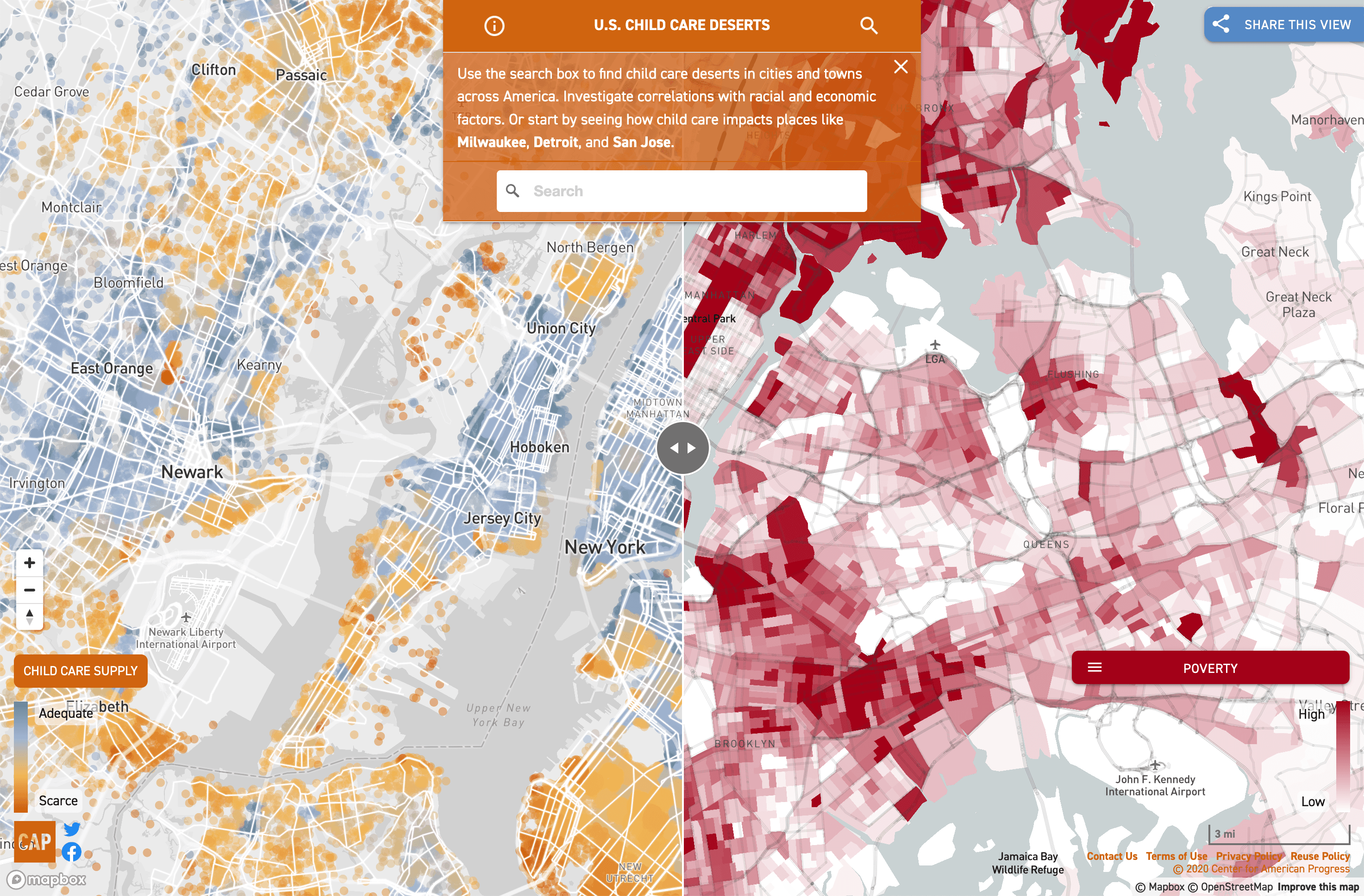
Child Care Deserts
Visit↗As the sole full-stack engineer and designer on the project, I partnered directly with the research team to translate their data into a comprehensive digital strategy. I owned the entire product lifecycle from inception to deployment—scoping the technical architecture, designing the complete UI/UX user journey, and establishing the application's visual brand identity. On the engineering side, I cleaned and architected the backend datasets, integrated Mapbox to optimize the heavy spatial rendering pipelines, coded the full frontend layout and interactive states, and executed the final cloud deployment and QA. While incorporating feedback from editorial, art, and executive stakeholders, every line of code and interface asset was individually handcrafted by me.
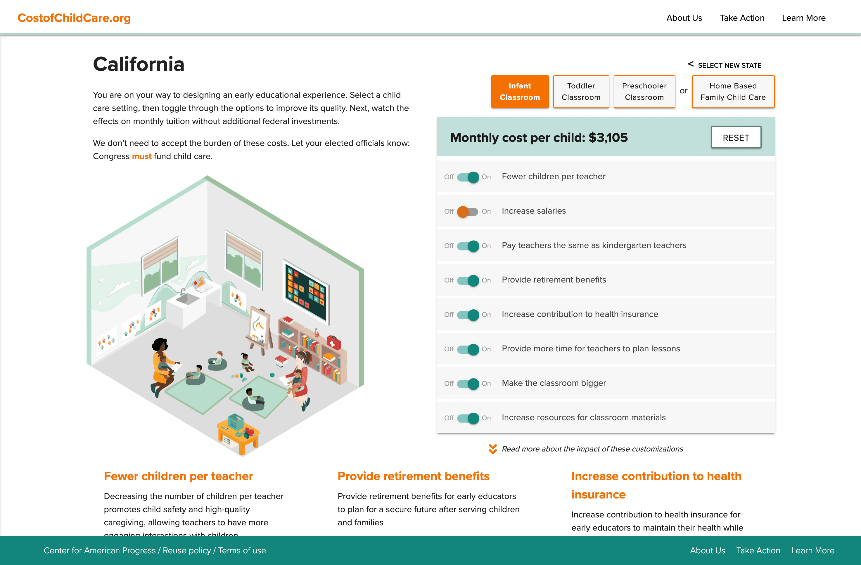
Cost of Child Care Calculator
Visit↗As the sole engineer and designer, I built the entire platform from the ground up—establishing a distinct brand identity and standalone web presence completely independent of the main CAP website. Partnering directly with policy researchers, I translated complex legislation criteria into an intuitive visual state machine. I designed the complete UI/UX layout and custom asset system, built a data engine to dynamically process localized state-by-state cost metrics, and coded the client-side rendering logic that translates real-time calculations into dynamic interface transformations. I held complete accountability for the full-stack codebase, visual branding, and final cloud deployment.
LGBTQ Survey Platform
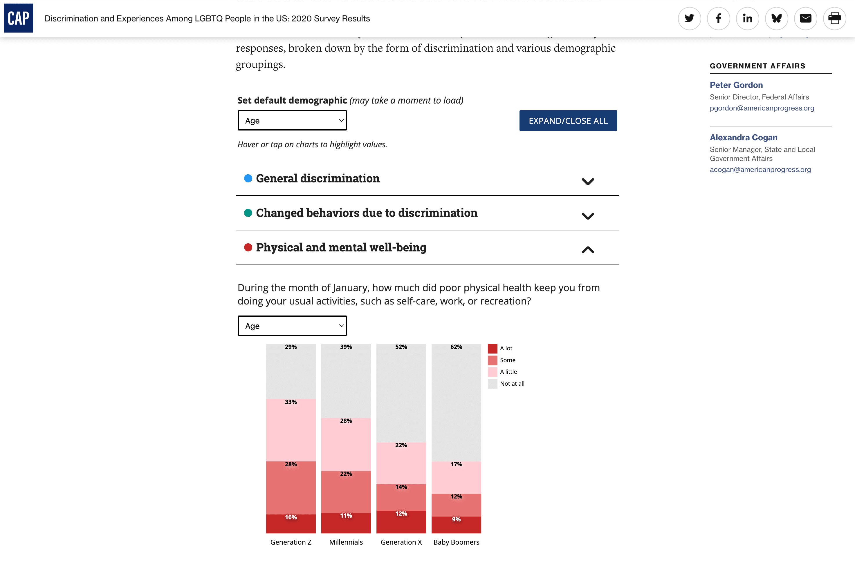
Visit↗Partnering directly with the lead research methodologists, I was responsible for architecting an interactive visual framework capable of making a dense, highly qualitative dataset instantly legible. To handle the unique multiple-choice parameters and custom legends required for each question, I designed a tailored data architecture and engineered fluid, responsive D3.js visualization charts from scratch. I built the universal state logic that dynamically swaps and cross-filters demographic data across more than 700 distinct views on the fly. Operating under strict layout constraints, I integrated this entire system into a seamless, native accordion footprint within a narrow column width, maintaining complete ownership over rendering optimization, UI design, and quality-of-life micro-interactions.
Selected Projects Matrix.
A filterable index of custom data portals, policy tracking databases, and interactive editorial layouts. Select a tag below to filter the directory by engineering scope or user experience pattern.
Child Care Deserts
An interactive, dual-pane national map visualizing childcare accessibility for 2.2 million modeled family clusters, featuring a real-time slider to compare geographic access against six demographic layers alongside scripted, fly-to data stories.
Cost of Child Care
A standalone childcare cost calculator platform featuring a unique brand identity, engineered from scratch to live-query databases and instantly update custom illustrations based on user state and age selections.
LGBTQ Survey Platform
A multi-layered data platform rendering over 700 native-styled D3 charts across 89 highly nuanced survey questions, featuring dynamic global and localized demographic filters, contrast-aware highlighting, and optimized accordion views.
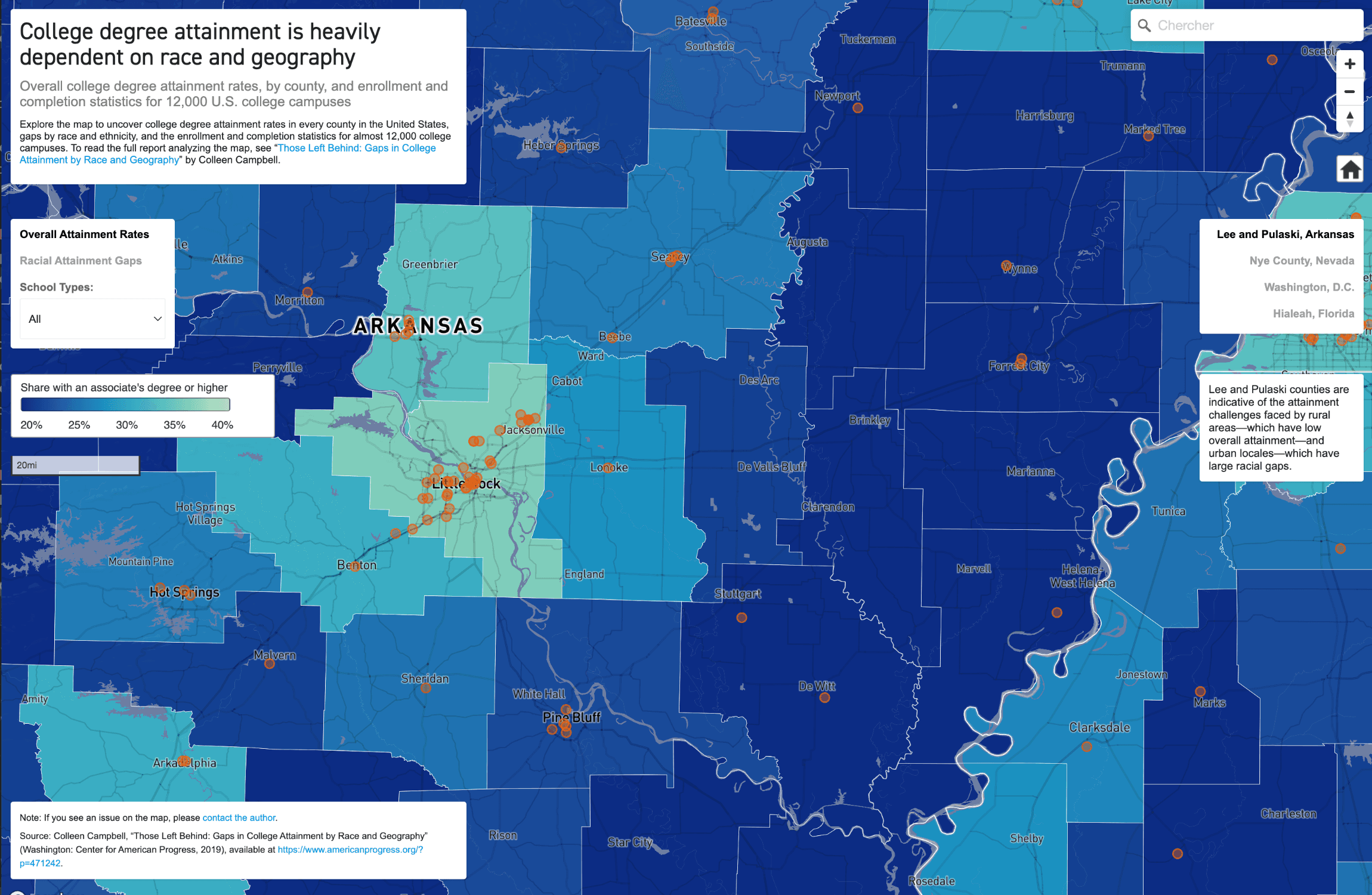
College Degree Attainment
A standalone interactive geospatial map plotting over 12,000 collegiate coordinates across county-level educational attainment layers, integrating narrative case studies to visualize college density correlation.
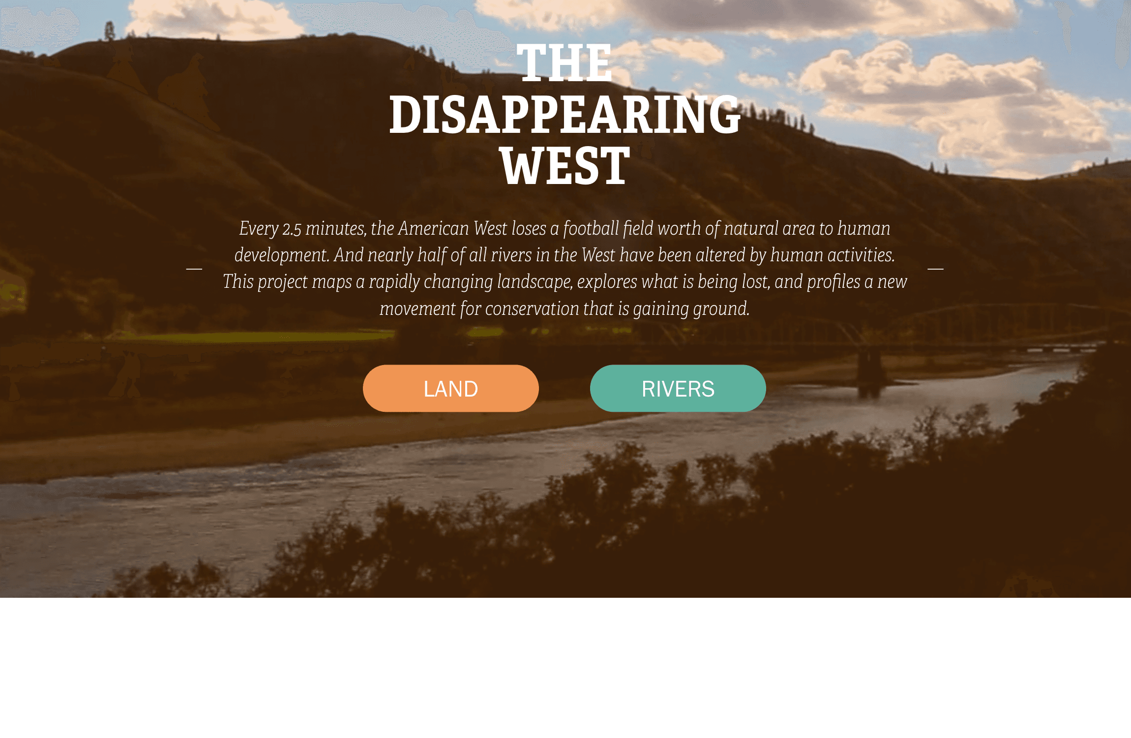
The Disappearing West
A major standalone conservation portal uniting two legacy sites into a cohesive brand experience, featuring a streamlined "lands vs. rivers" navigation structure, interactive map, dynamic web-native data tables, and animated illustrations.
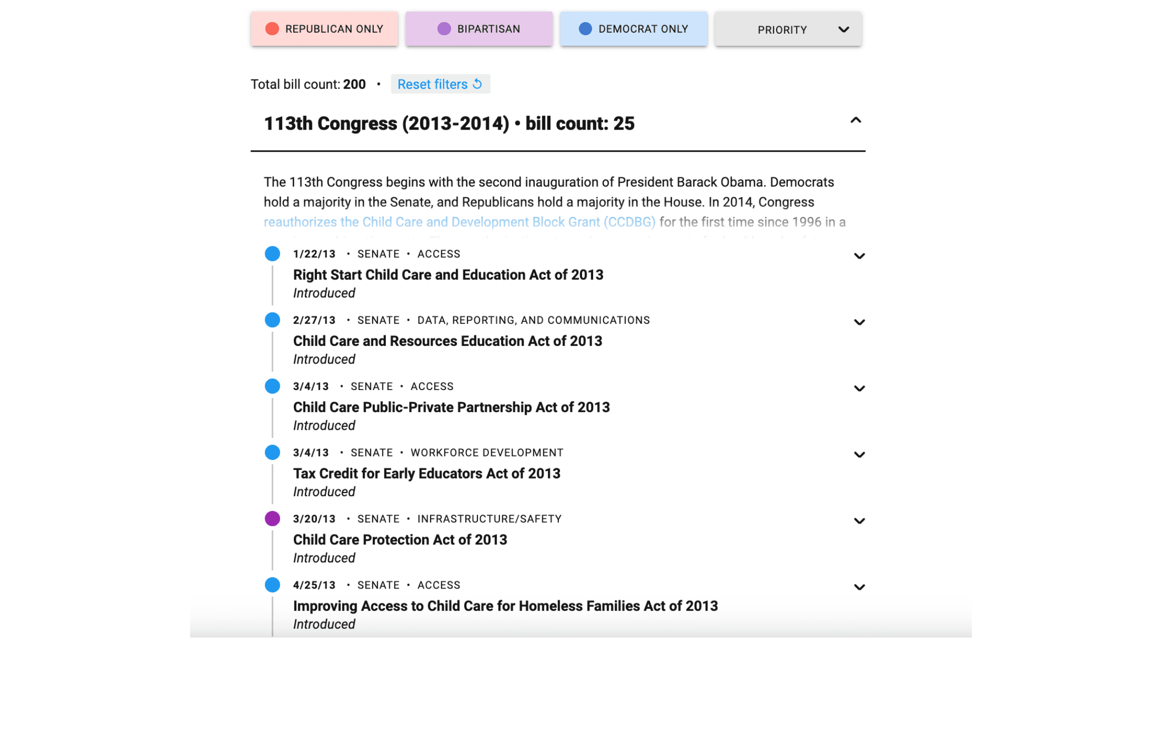
Federal Child Care Legislation Over the Past Decade
A comprehensive child care policy timeline charting 200 pieces of legislation, utilizing party-based color-coding, targeted policy filters, and dynamic Congress section headers that hide when empty to optimize readability.
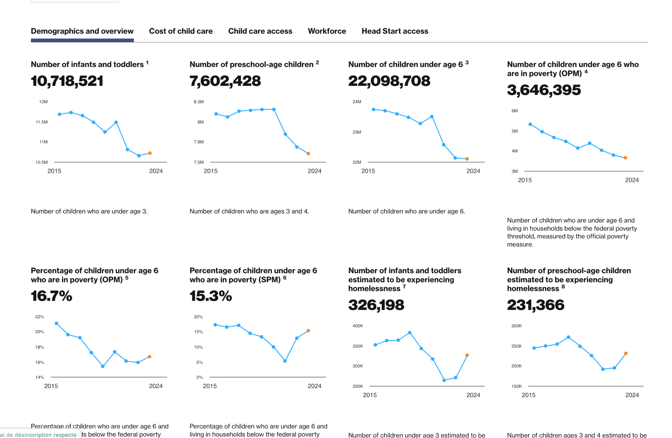
Data on Early Learning
A comprehensive child care data portal integrating three distinct native dashboards—a national metrics overview, an individual state tracker, and an interactive map—to visualize a decade of key policy datasets.
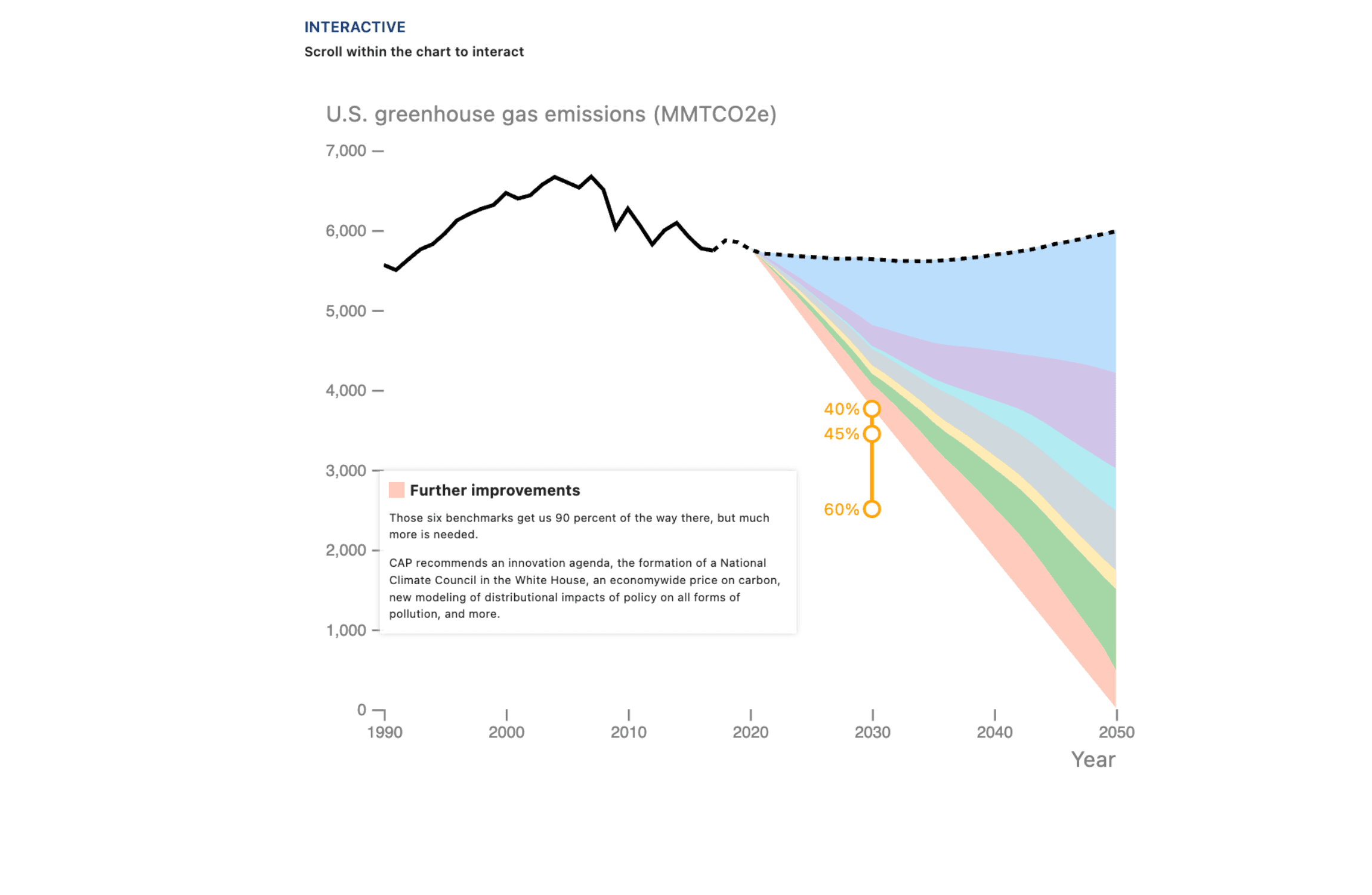
A 100 Percent Clean Future
An interactive scrollytelling visualization featuring an animated hybrid line and stacked area chart that dynamically highlights data segments and triggers explanatory narratives linked to scroll-position milestones.
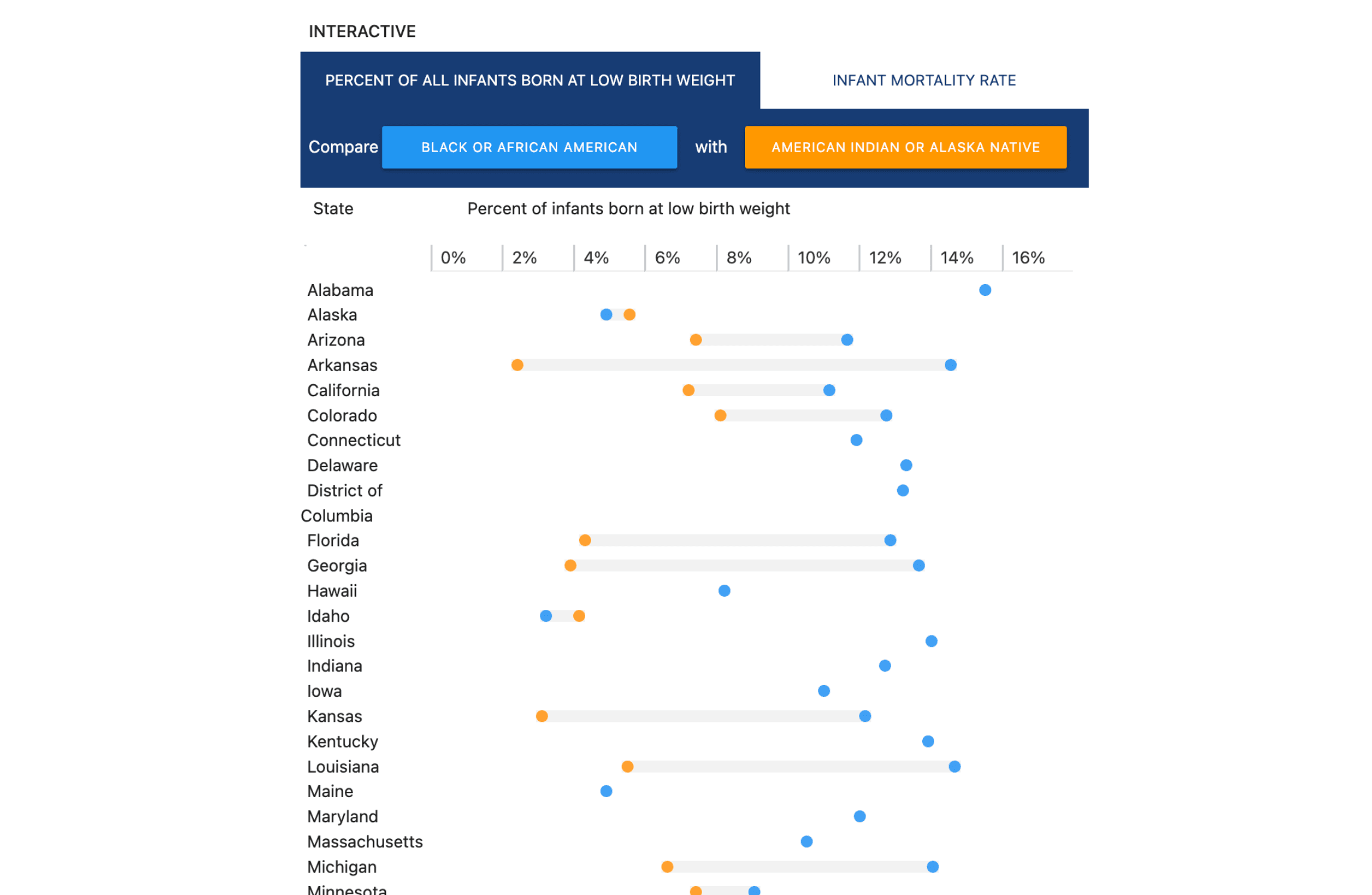
Infant Health Outcomes
A comprehensive health equity tracker displaying 51-state gap plots across low birth weight and mortality metrics, featuring a cross-demographic filtering engine with auto-disabling dropdown selectors and hover states.
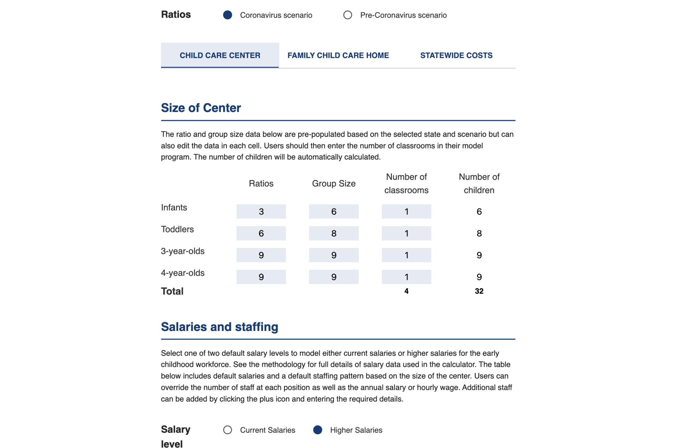
COVID Child Care Costs Calculator
An advanced multi-tab child care simulator modeling state-by-state pandemic operating costs, empowering users to customize staffing matrix parameters, employee benefit scales, and sector coverage to project localized expenses.
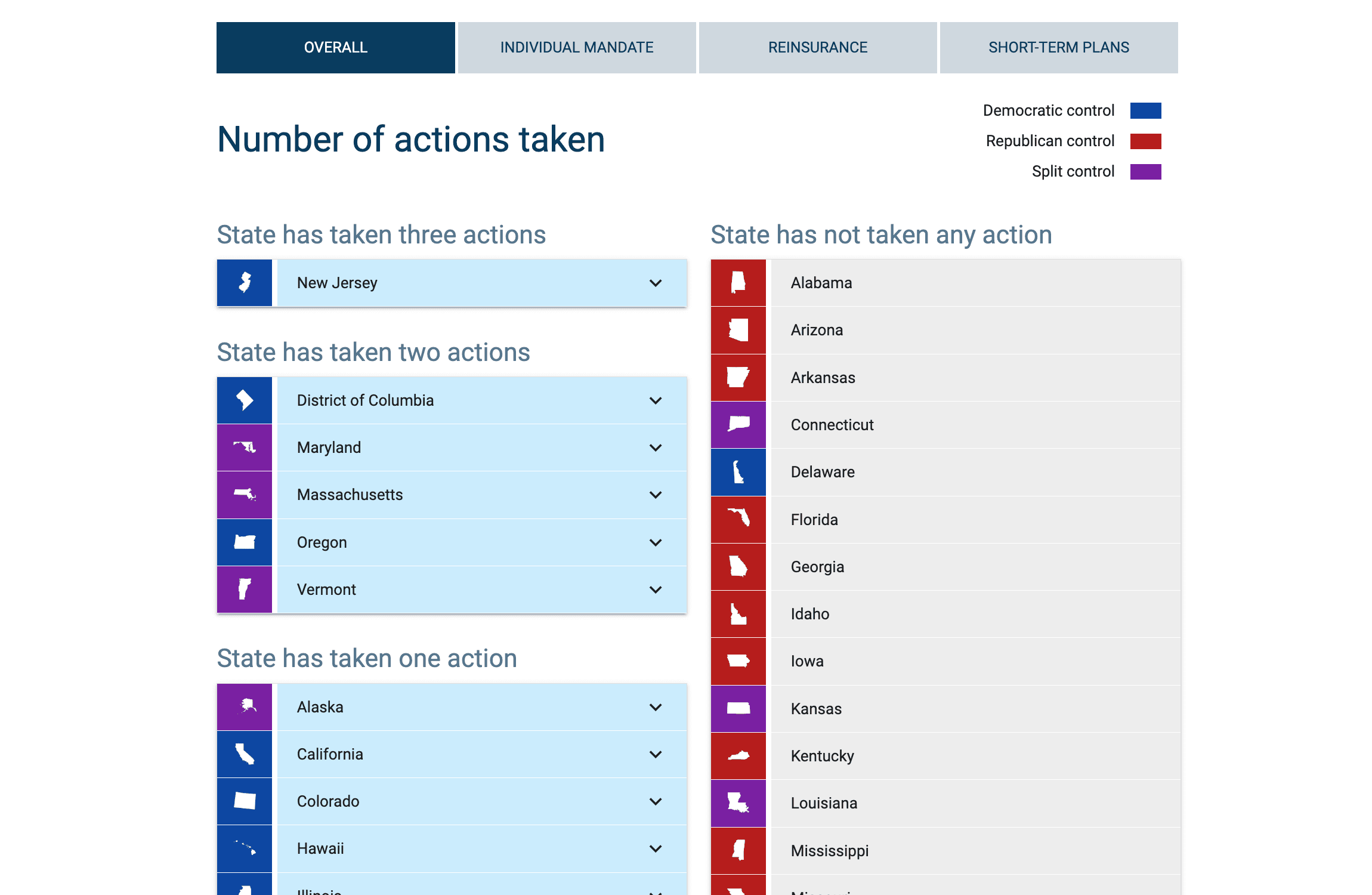
State Actions Against Federal ACA Sabotage
A unified healthcare policy tracker replacing maps with a streamlined, icon-led state directory, using targeted category filters to isolate legislative milestones and trigger interactive regional progress accordions.
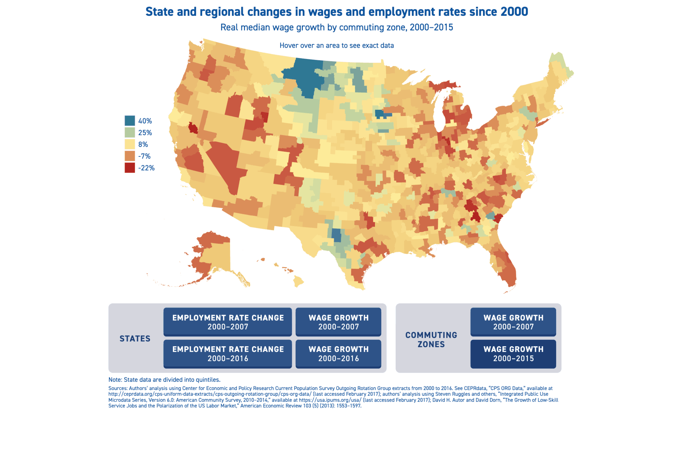
Midwestern Recession
Mapping regional economic trends, this geospatial interface plots wage and employment shifts across six distinct views, allowing users to toggle between 51-state borders mapped by quintiles and detailed commuting zones.
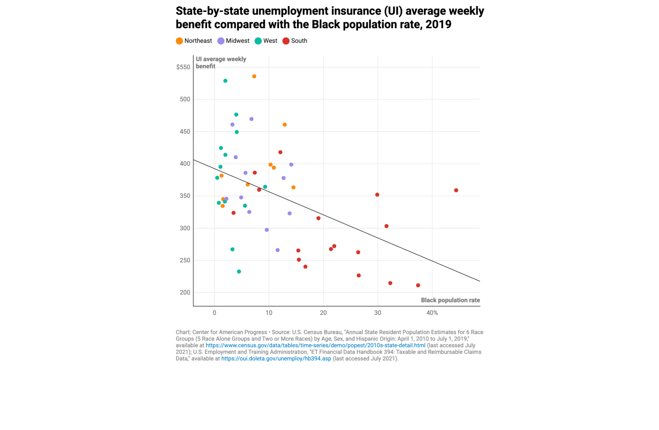
How Weak Safety Net Policies Exacerbate Inequality
Optimizing limited screen real estate, this compact interactive figure utilizes a rapid-update numeric dropdown to render 27 distinct dot plots, packing dense socioeconomic inequality datasets into a single fluid container.
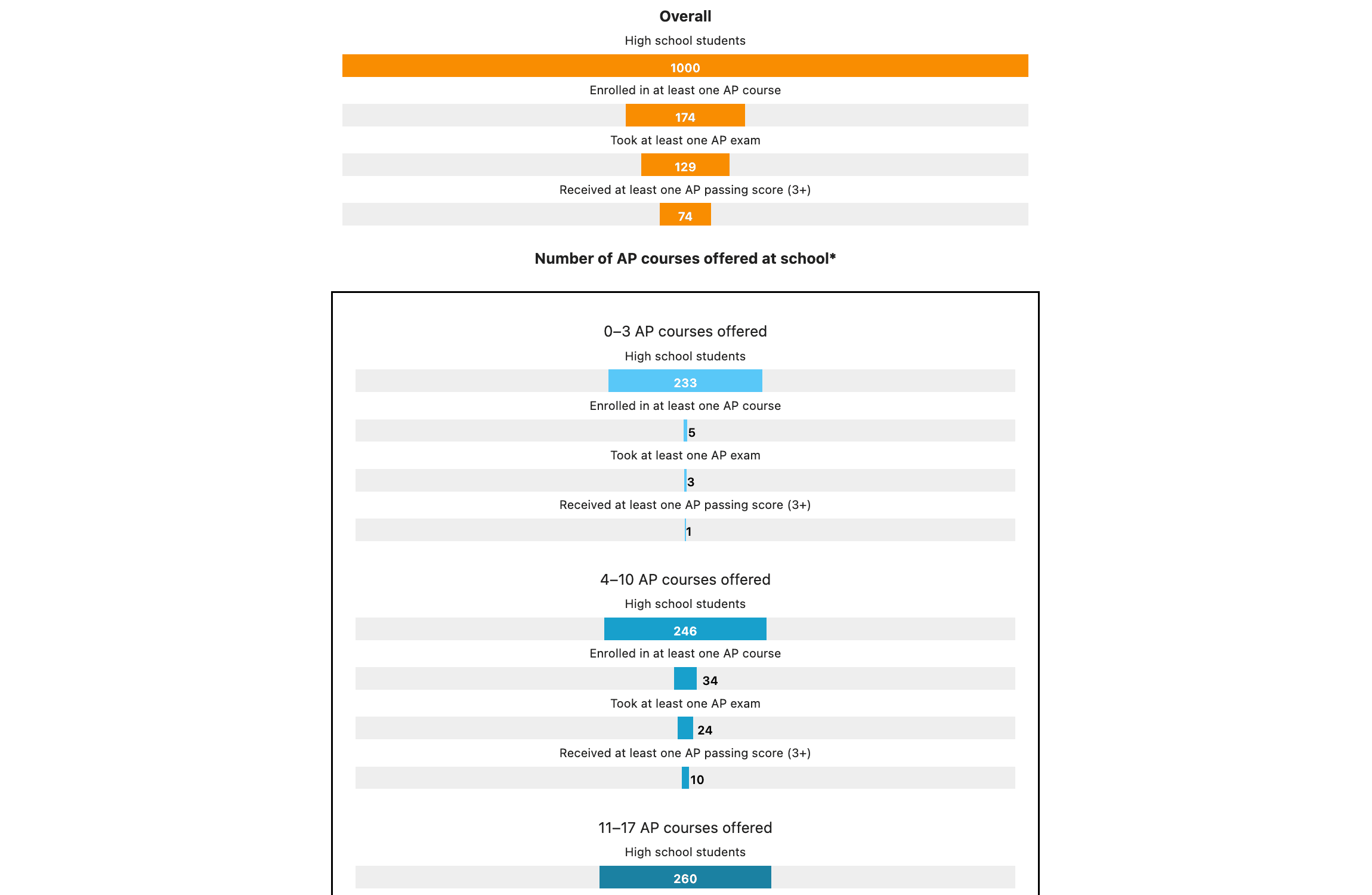
Closing Advanced Coursework Equity Gaps for All Students
Illustrating systemic education gaps, this custom data visualization models a 1,000-student AP course-to-exam pathway using 20 dynamic horizontal bar charts to map institutional access and student performance by demographic.
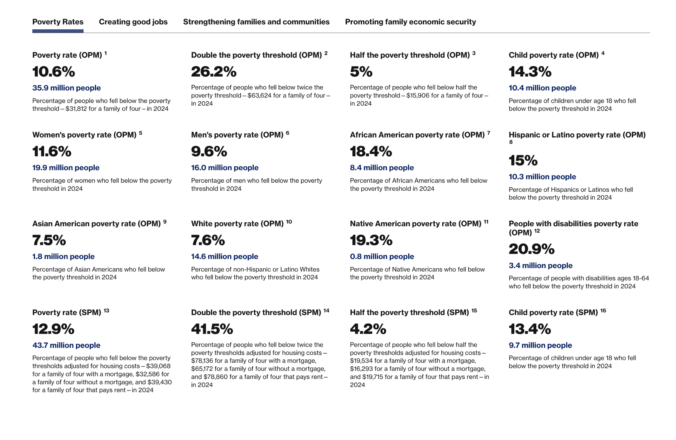
Data on Poverty in the U.S.
A robust multi-view data portal benchmarking socio-economic metrics across 2018–2024, featuring a four-way head-to-head state comparison engine, time-series mapping, and granular demographic ranking tools.
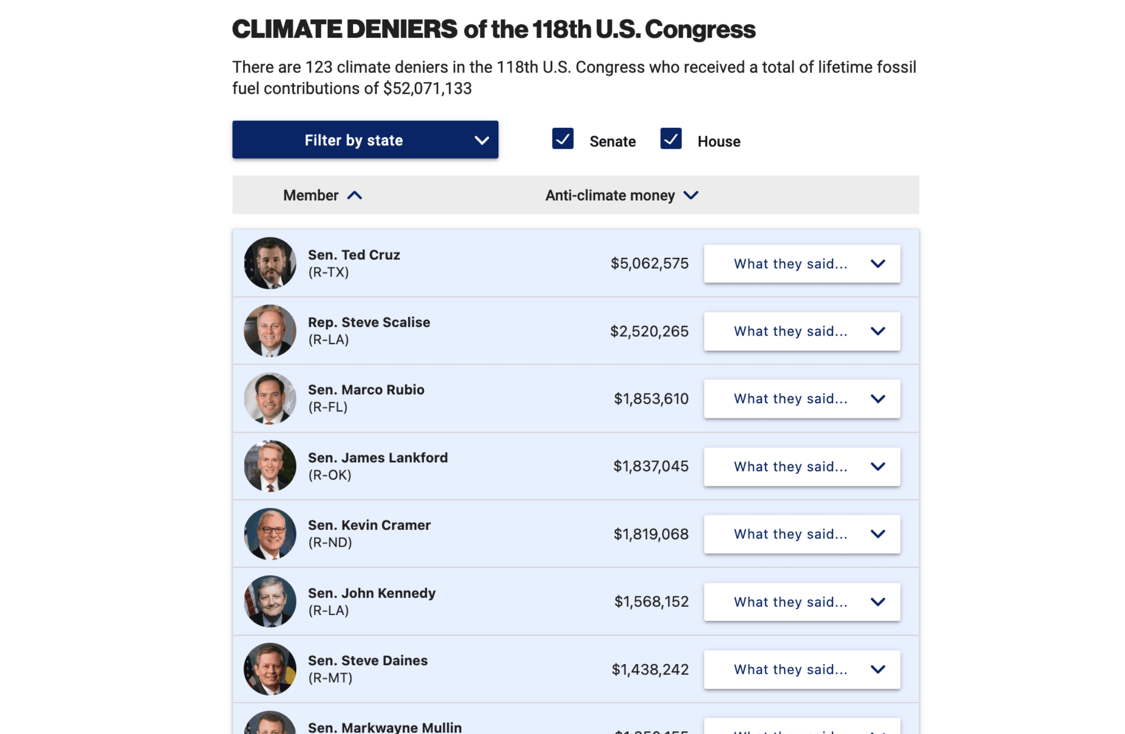
Climate Deniers of the 118th Congress
A dynamic congressional tracker auditing 123 federal climate deniers, featuring dynamic campaign finance sorting, chamber-specific view toggles, and interactive directories that expand to reveal sourced quotes.
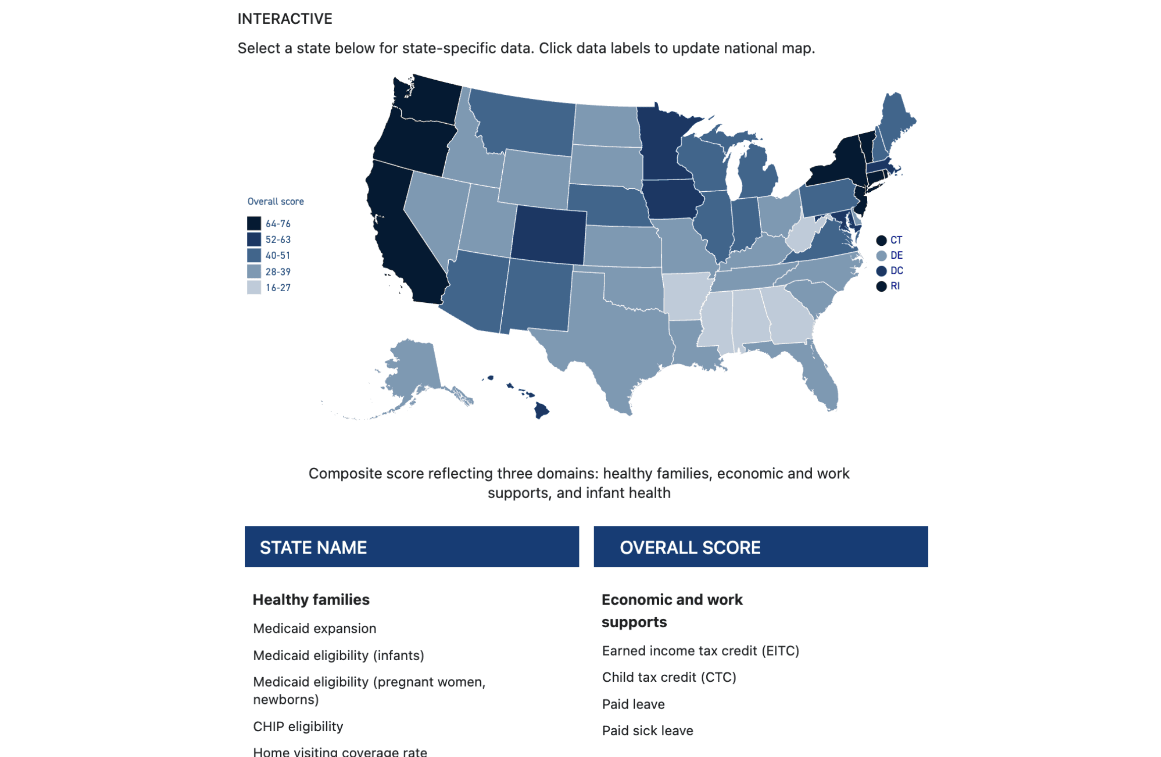
Opportunities for States to Improve Infant Health Outcomes
A multi-layered healthcare map visualizing 969 regional data points, allowing users to toggle 19 metrics across three clinical groups to instantly re-project, recolor, and recalculate national-scale policy disparities.

Equitable and Just National Climate Platform
Designed from the ground up, this custom multi-page standalone website establishes a unified brand identity and digital hub for a historic climate coalition, integrating dedicated Justice40 resources and community stories.
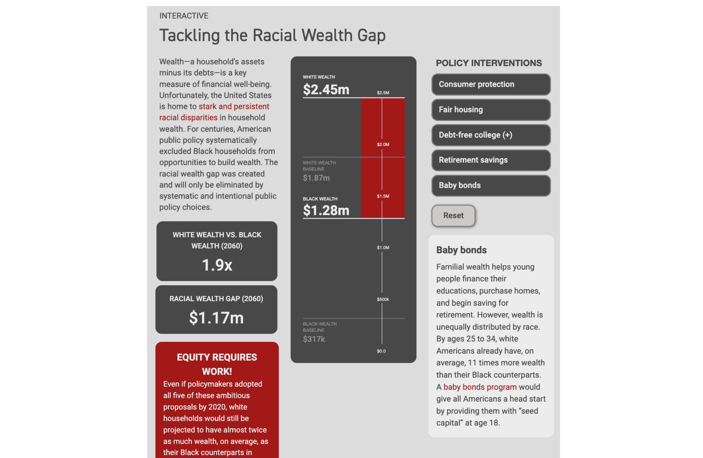
The Racial Wealth Gap
A scenario-based policy modeling tool visualizing the racial wealth gap, utilizing interactive toggle combinations to dynamically recalculate future wealth projections alongside an animated chart anchored to static baselines.
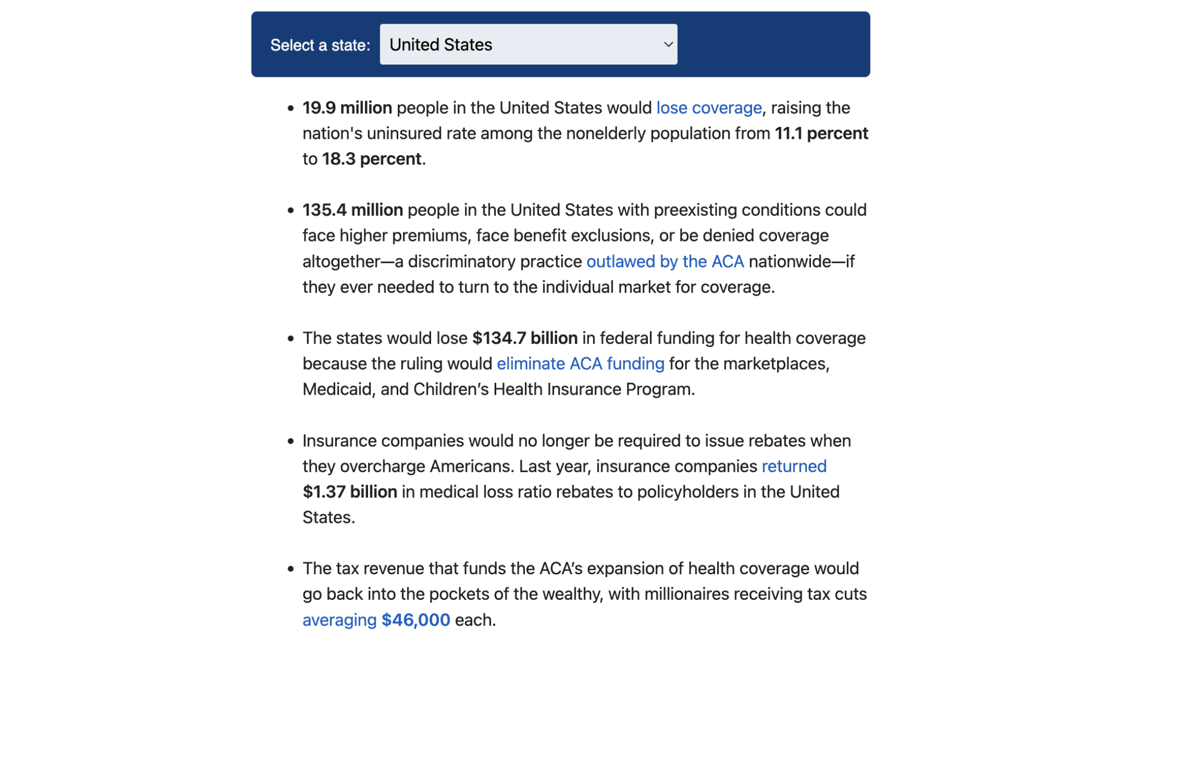
Affordable Care Act Repeal by State
Converting static report data into a dynamic inline selector, this tracker displays targeted demographic harms of healthcare policy rollbacks nationally and across all 51 states using an interactive, drop-down-driven impact engine.
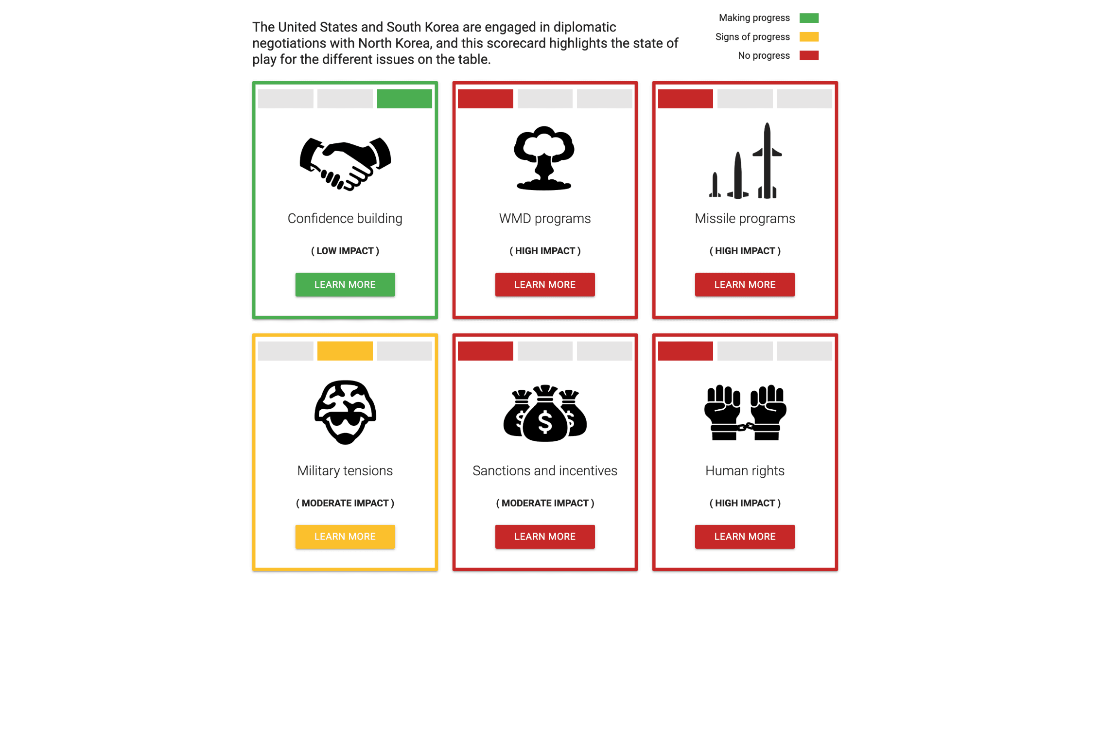
North Korea Diplomacy Scorecard
Visualizing critical geopolitical metrics, this interactive index displays six color-coded diplomacy cards with dynamic impact ratings, utilizing slide-up panels to unpack the qualitative evidence behind each status.
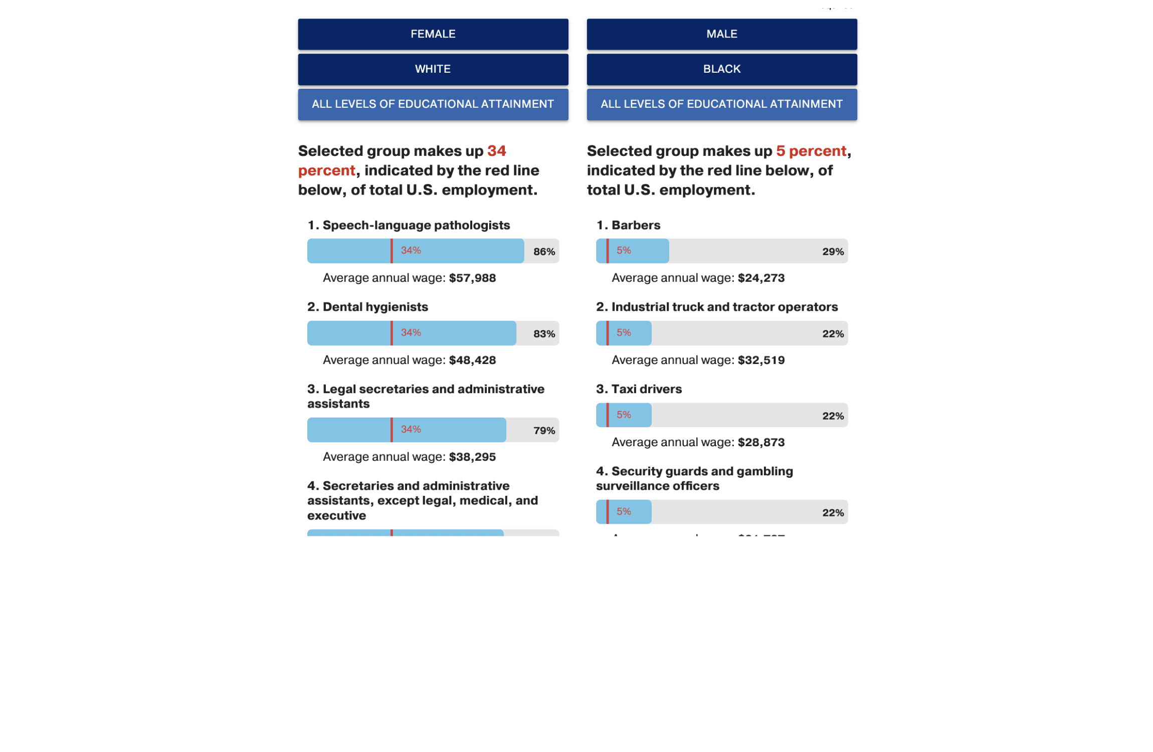
Occupational Segregation in America
Analyzing economic representation, this dual-column comparison tool maps the top 15 jobs across 60 demographic permutations, using overlaid horizontal bar charts to benchmark target groups against overall workforce averages.
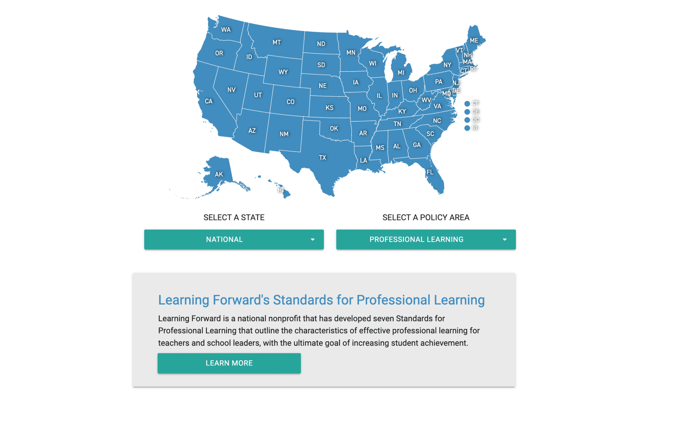
Nationwide Efforts to Elevate the Teaching Profession
Combining a spatial map interface with dual-dropdown filters to query a database of 93 educational initiatives, this interactive tracking tool streamlines the discovery of regional teaching policies and resource directories.
Monumental Superstars
Highlighting 22 threatened public lands, this interactive showcase uses a dual-dropdown filter to navigate rich media cards featuring nested geospatial mapping, regional data tables, and environmental impact deep dives.
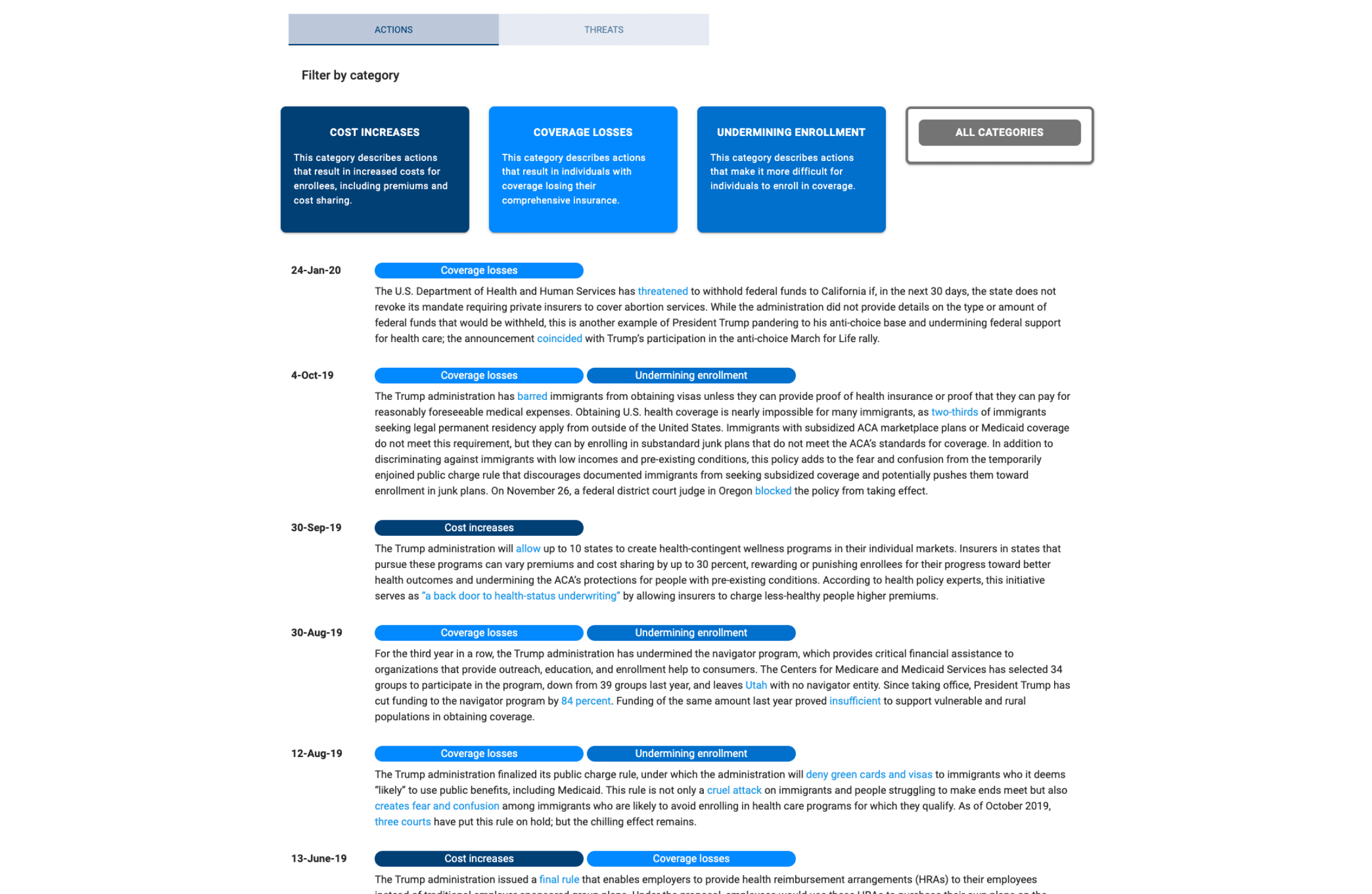
Tracking Trump's Sabotage of the ACA
Splitting executive policy tracking into dual pathways, this healthcare timeline contrasts 49 categorized legislative actions with 11 primary-sourced rhetorical threats to map the systemic deregulation of the ACA.
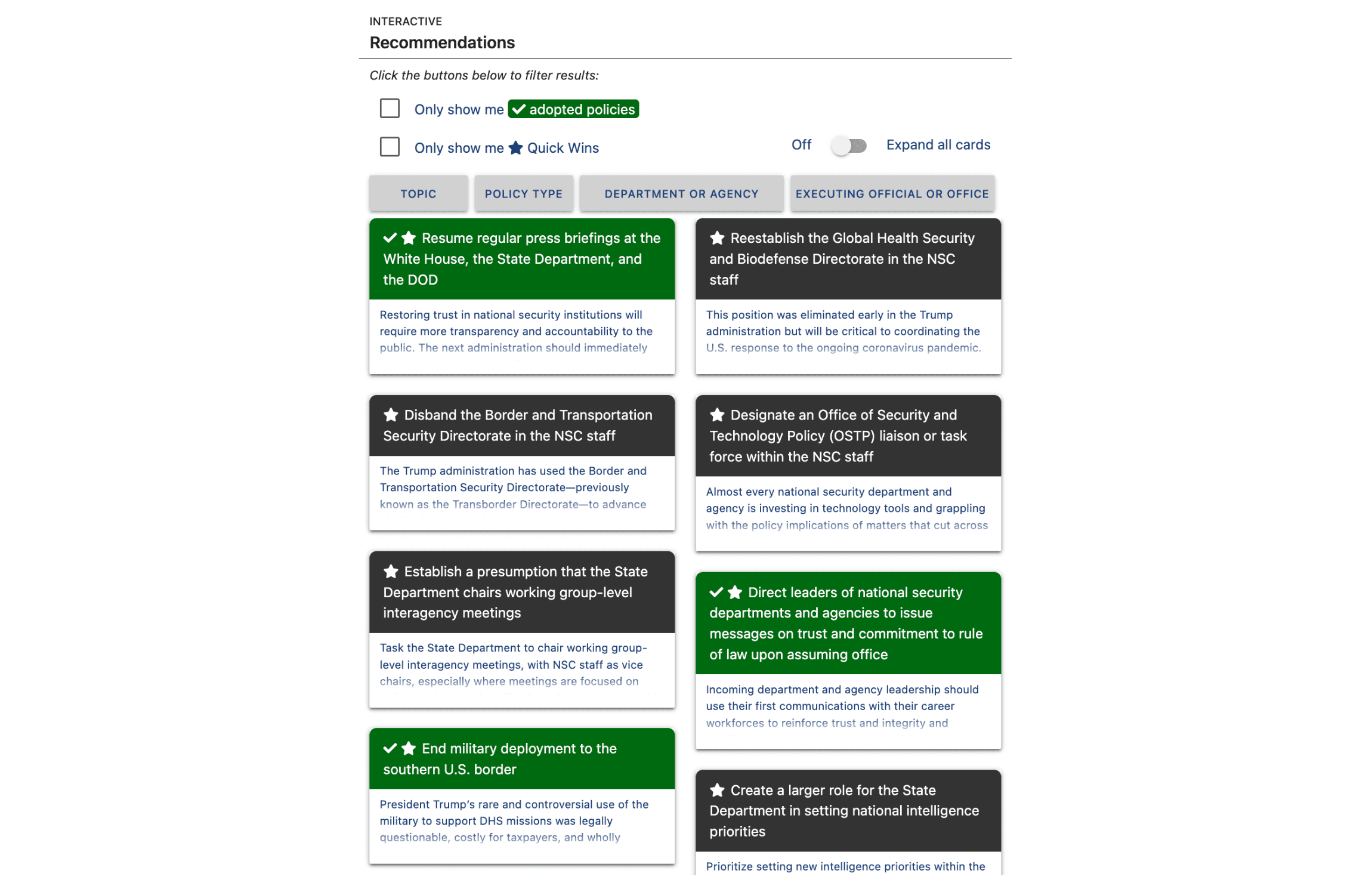
The First 100 Days
A comprehensive policy directory housing nearly 250 federal recommendations, utilizing multi-layered card-tag filters, progress status indicators, and intersecting drop-downs to track executive action and adoption.
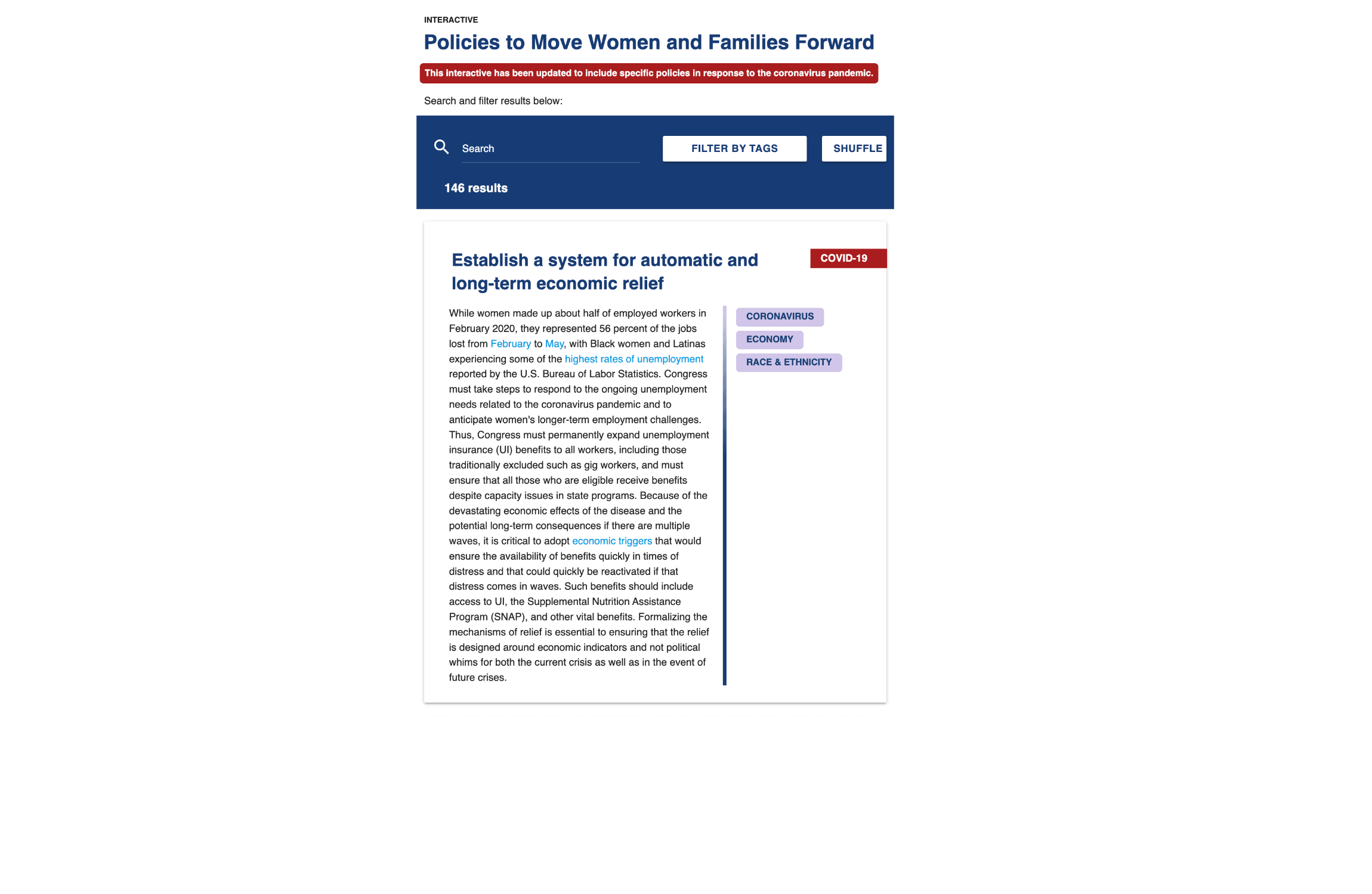
An Agenda to Move Women and Families Forward
Housing 146 gender-equity policy proposals, this database uses autocomplete search, category dropdowns, and a shuffle toggle to navigate rich cards featuring inline topic tags and high-visibility crisis response markers.
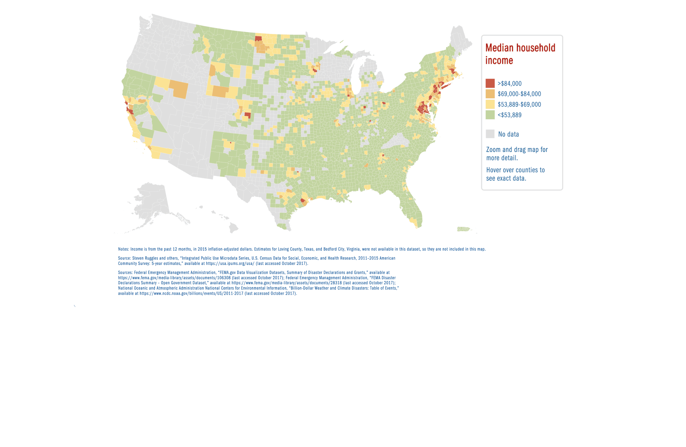
$1 Billion U.S. Extreme Storm Disasters
Mapping environmental vulnerability, this geospatial interface visualizes localized socio-economic data across thousands of counties, letting users overlay household poverty metrics with severe storm declarations over the course of seven years.
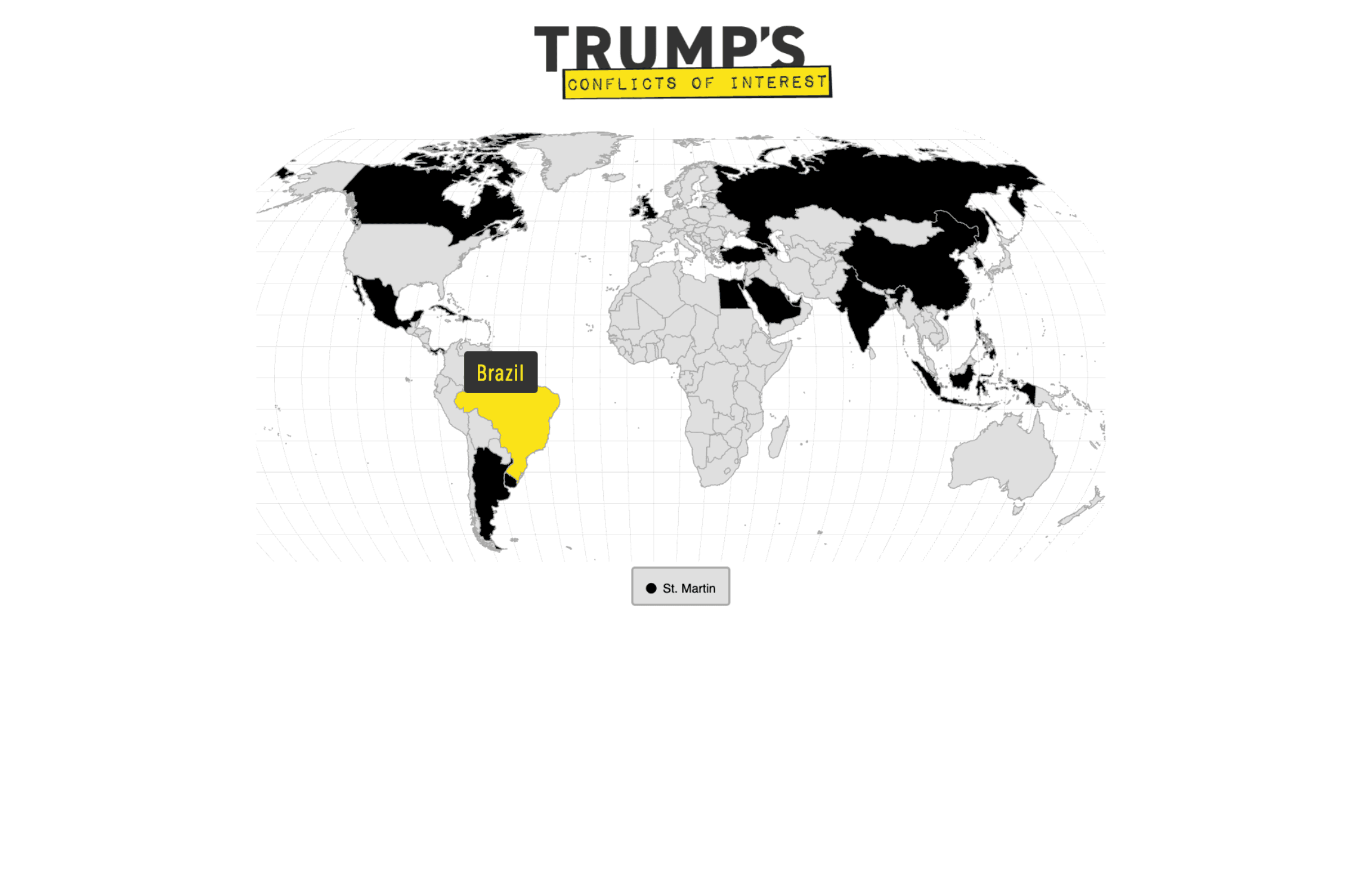
Trump’s Conflicts of Interest
Exposing global financial entanglements, this branded world map highlights 25 countries of concern, featuring interactive spatial boundaries, dual-zoom orientation cards, and sequential narrative carousel controls.
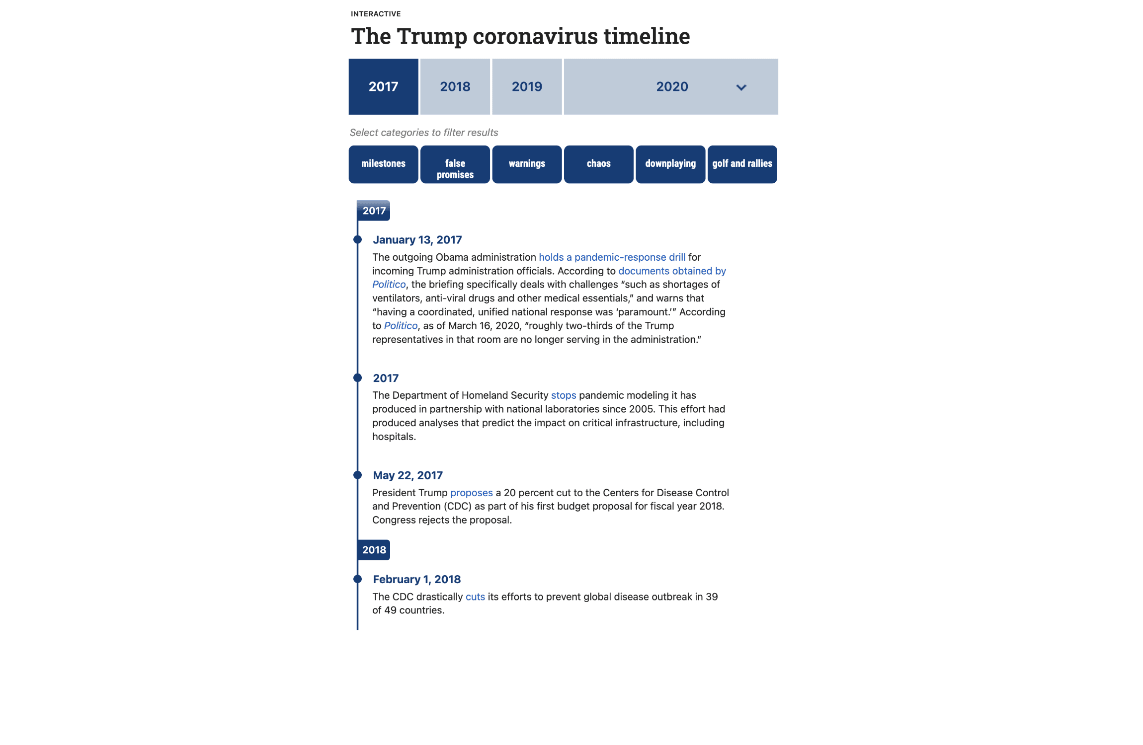
‘Blinking Red’: A Running Timeline
Exposing systemic federal pandemic inaction, this high-density timeline maps over 400 ignored warnings, policy missteps, and delays across four years using yearly and monthly scroll anchors and six additive narrative filters.
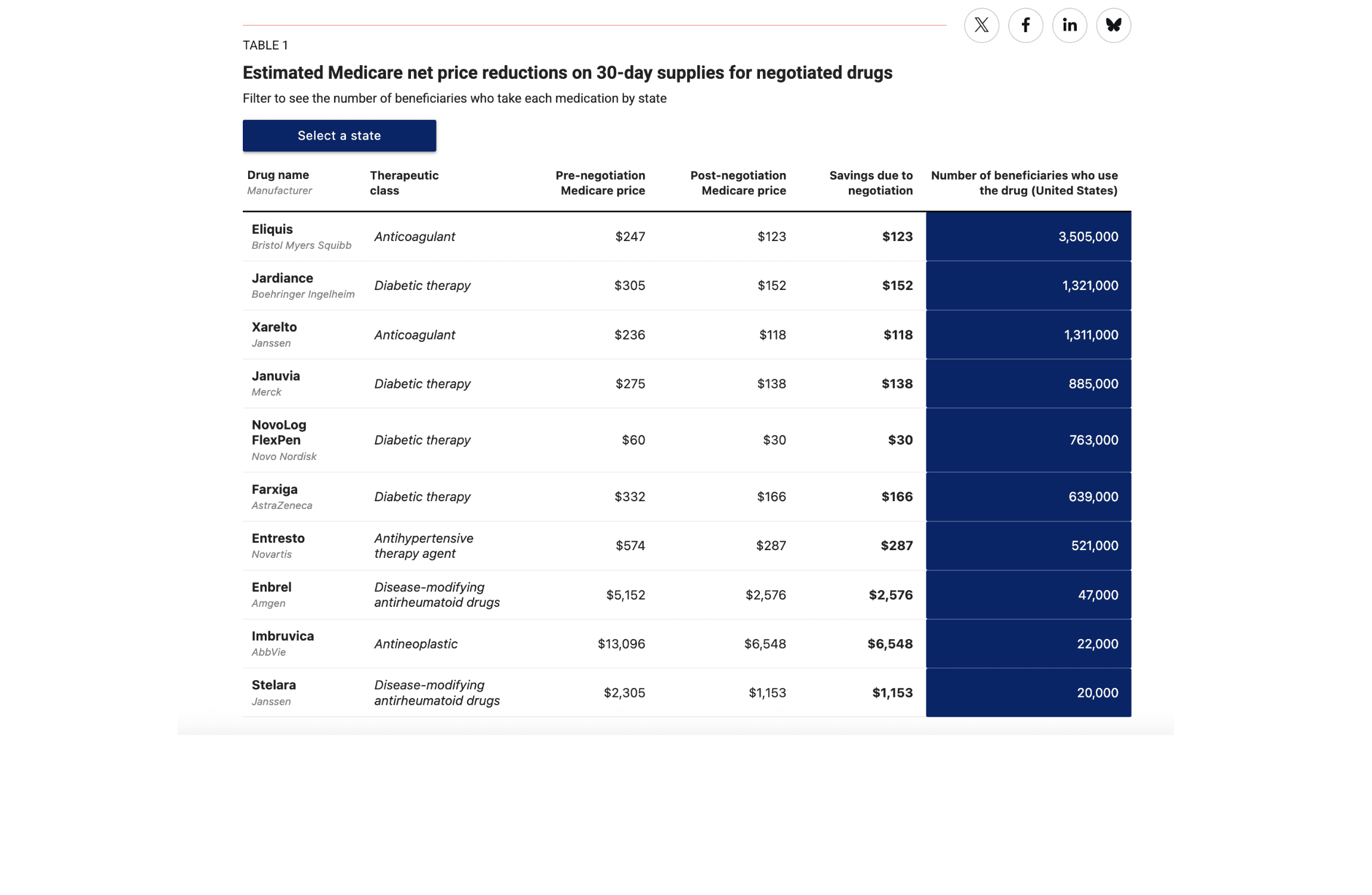
Monthly Medicare Drug Price Negotiation Savings by State
Translating federal healthcare reform into localized impacts, this interactive table calculates state-by-state Medicare drug savings across 10 prescription categories, utilizing dynamic population and price-drop estimates.
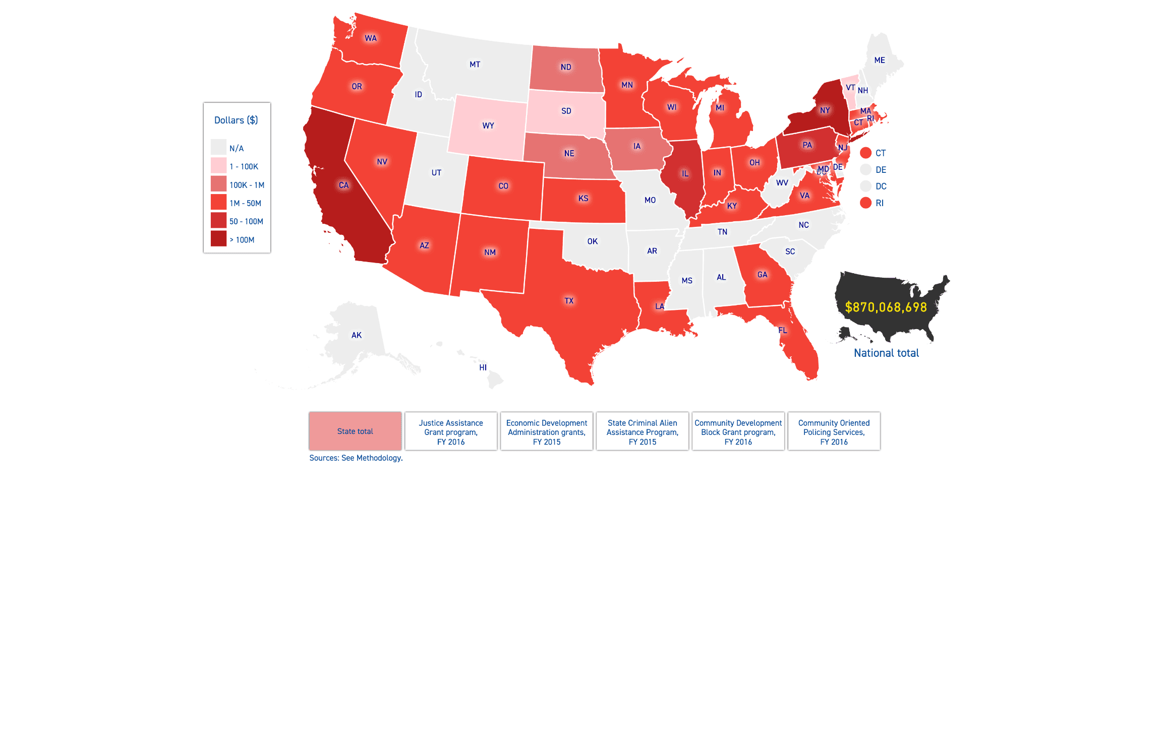
Funding at Risk in Jurisdictions with Sanctuary Policies
Exposing systemic financial threats, this 51-state spatial map plots localized community grant dollars vulnerable to federal defunding, utilizing dynamic zoom-to-state boundaries and a real-time national silhouette ledger.
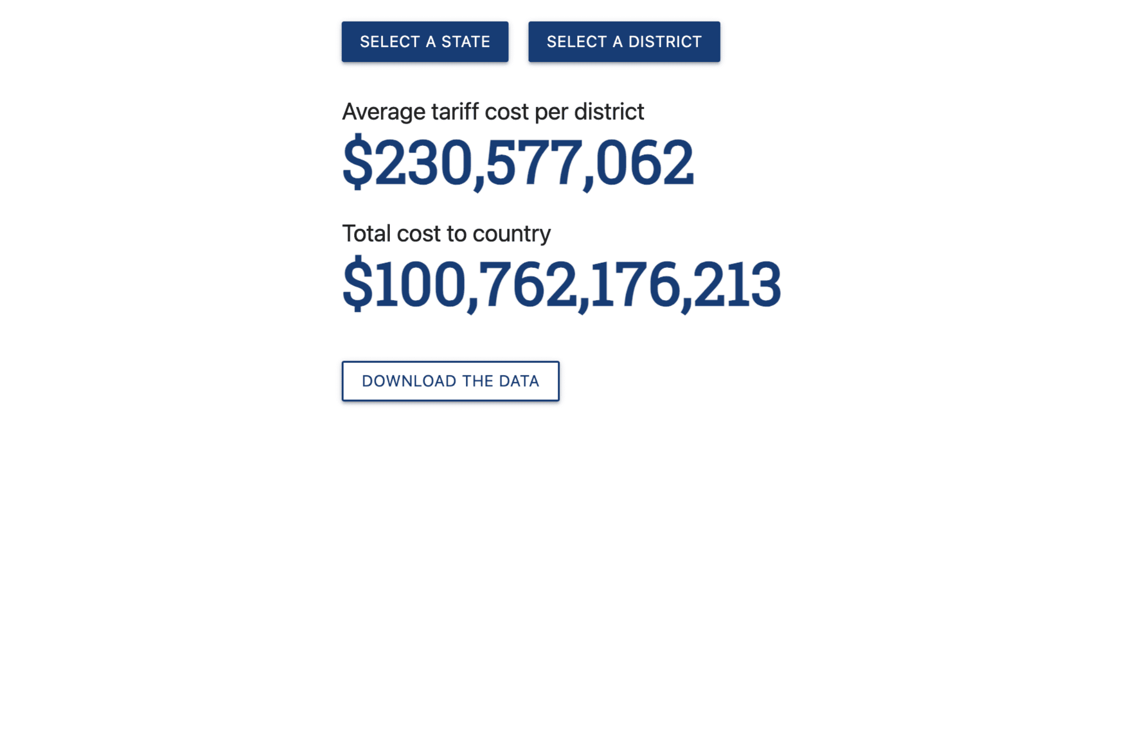
China Tariff Costs by Congressional District
Exposing the local toll of federal trade policy, this targeted impact calculator uses dual-dropdown inputs to instantly populate a high-impact callout block showing average household tariff costs by congressional district.
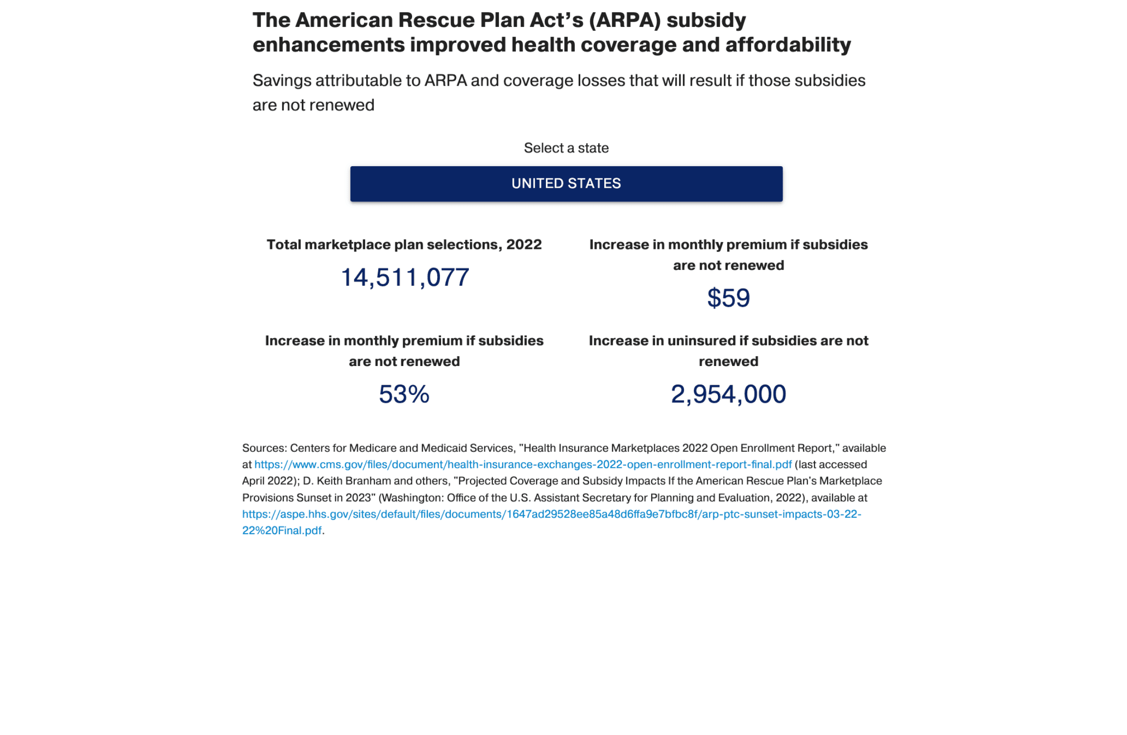
Health Premiums Will Rise Sharply Unless Congress Acts
Quantifying the regional cost of policy expiration, this inline dashboard uses a state-by-state and nationwide dropdown to instantly project premium hikes and coverage losses if critical healthcare subsidy enhancements are not renewed.
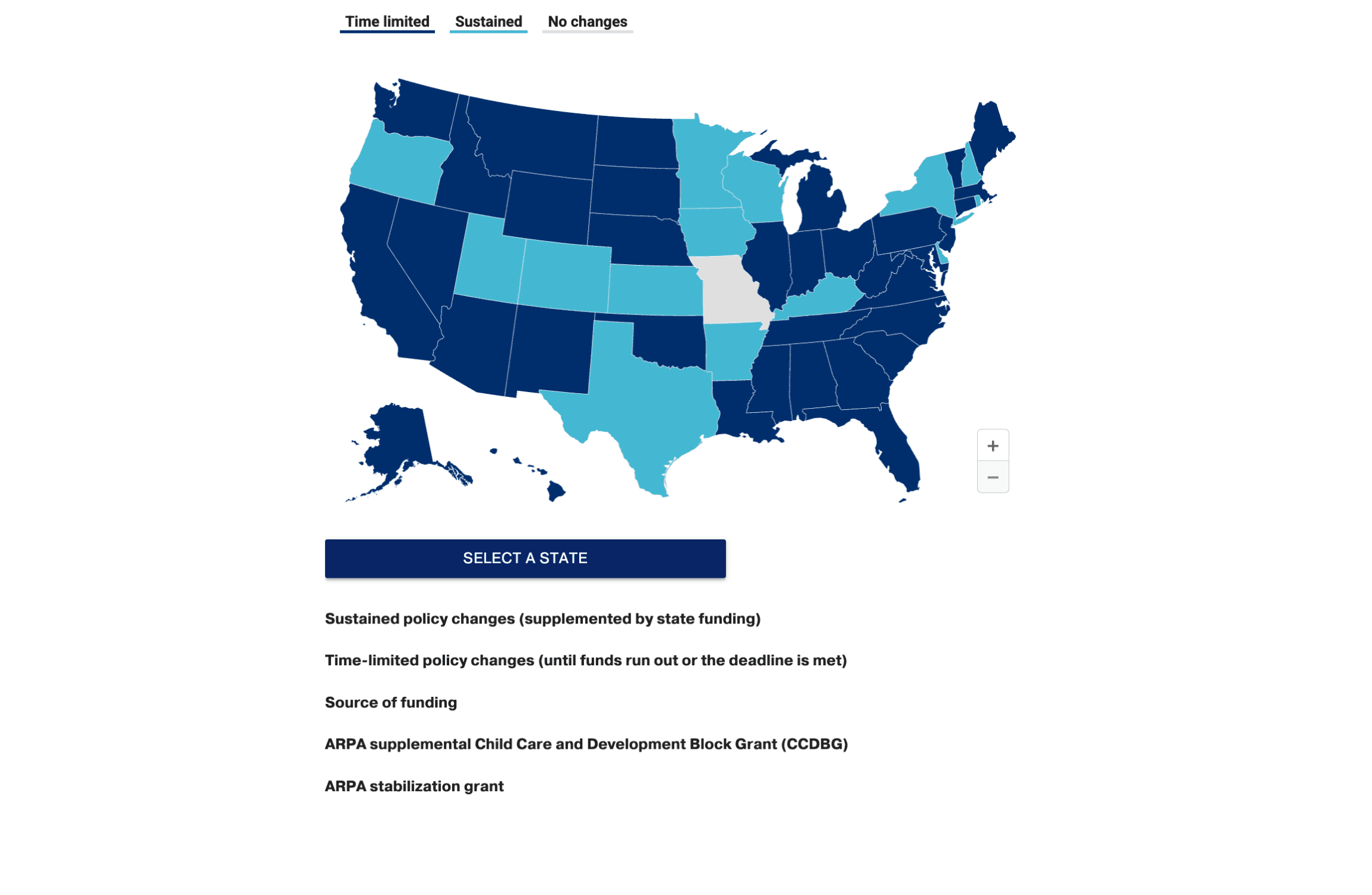
The American Rescue Plan Shored Up Child Care
Auditing federal policy investments, this 51-state map interface pairs a localized dropdown with a spatial layout to track ARPA stabilization funding scales, local policy actions, and targeted child care infrastructure grants.
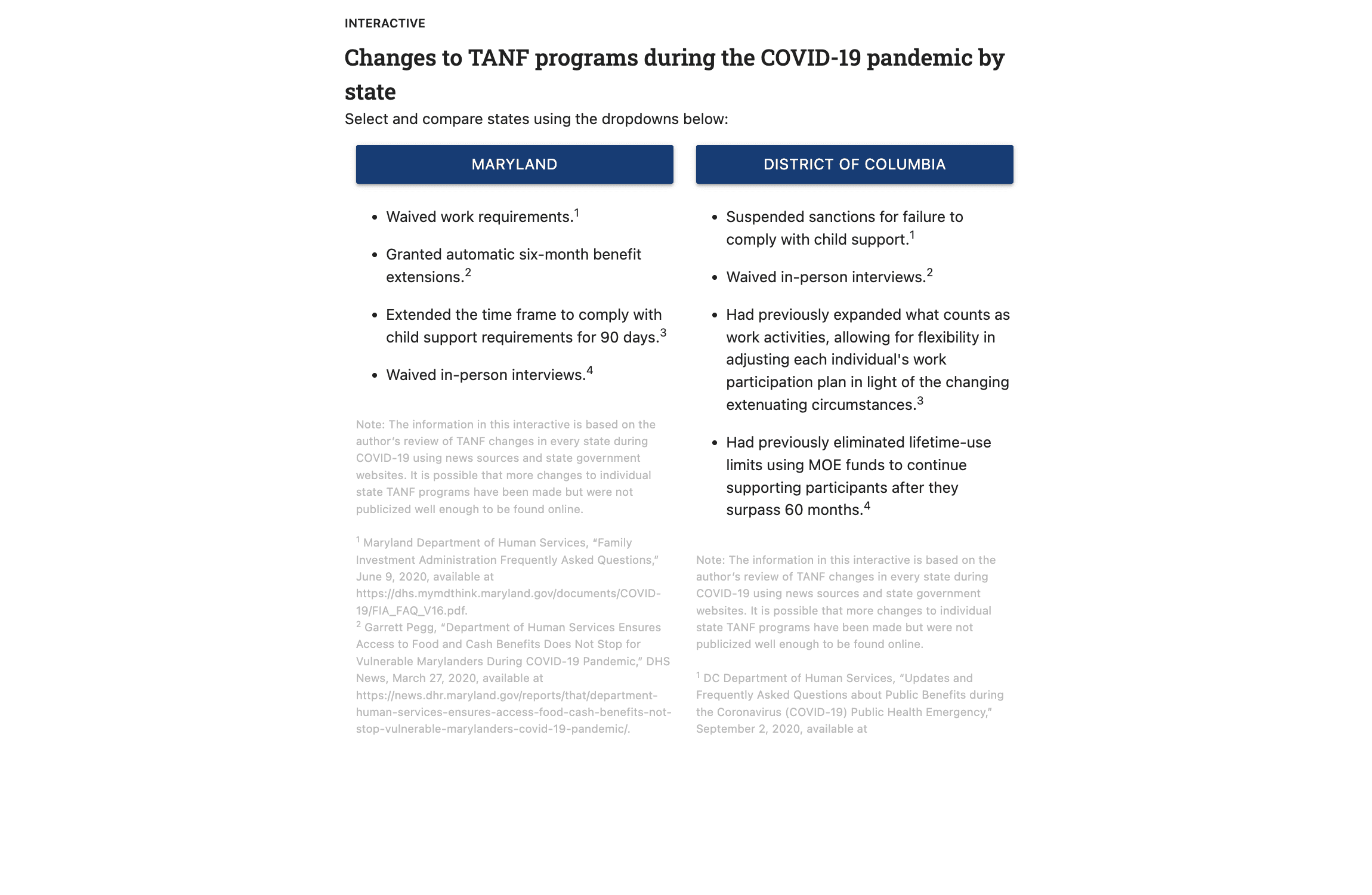
How States Can Use TANF Funds to Help More Residents in Need
Analyzing state safety net adaptations, this dual-column policy comparison tool uses parallel state dropdowns to display side-by-side TANF reforms, featuring inline footnote popups for primary-sourced legal and policy citations.
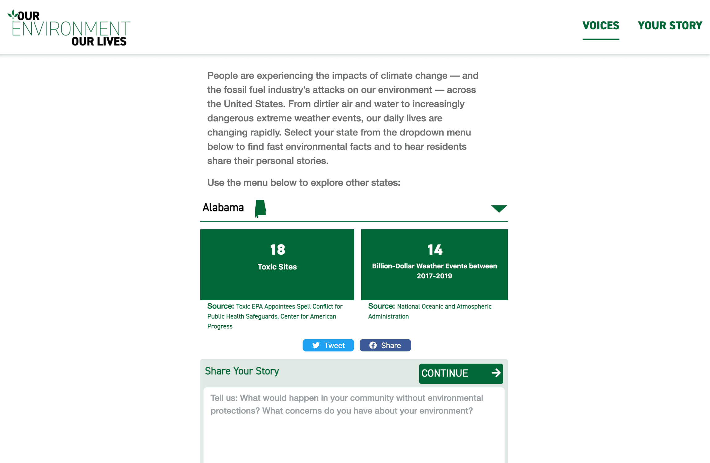
Our Environment, Our Lives
Serving as a localized climate registry, this branded standalone web platform pairs state-by-state toxic site and financial damage metrics with an interactive community portal designed to gather and archive citizen testimonials.